A lot of times a customer will bring us a piece of art that is very dark and, while we’re looking at the design, we’ll be asked to “lighten it up” with a light-colored mat.
While this might seem like the right thing at first, this actually makes the picture look darker and muddy. Why?
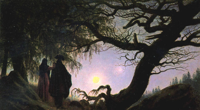
Take a look at this work here.
It is a dark night scene, illuminated only by the moon with Venus glowing brightly nearby. The colors, composition and title (Man and Woman Contemplating the Moon) all tell us that the artist wants the moon to be the focal point.
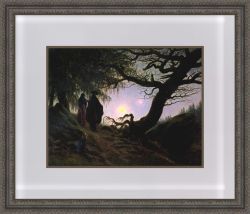
Let’s see what happens when we put a light mat on it:
The light mat is a strong contrast to the dark colors, making them look even darker and more prominent, exactly the opposite of what was expected. Your eye is drawn to the tree and the man in a dark cloak instead of the night sky.
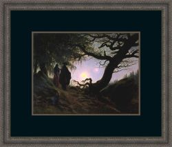
A dark mat is more in keeping with the spirit of the artwork and provides a great contrast to the lighter colors. The sky and the moon shine brightly, pulling your eye into the picture. Even the dark ground looks lighter now that you can see some of the highlights better.
The artwork is always a good guide, and, when you take a little time to really look at it and consider what the artist wants you to see, it will tell you how it wants to be framed. The secret is being a good listener.


